UX/UI Designer

Figma, Photoshop,
Procreate, Whimsical,
Miro

8 Weeks
Background
Most children are encouraged to learn an instrument, which is important as it teaches them accountability and self-discipline.
However, our fast-paced lives and reliance on technology seem to limit our attention spans more and more – and this is especially true with children!
They can lose interest quickly either because the lessons are a challenge, or they simply find it boring, and may give up on practicing.
Problem
How can young musicians easily keep track of their progress and have a more enjoyable practice experience?
Solution
Design an iOS app end-to-end for young children with the goal of helping them record their progress learning an instrument. This app should be motivating, engaging, and delightful.
Help children keep track of their progress while learning a musical instrument and make practicing more enjoyable!
Key Features
- Track practice sessions
- Keep practice “streaks” going (progress bar)
- Playlist practice material (songs, workbook pages, recital pieces)
- Check off material practiced (chart) Calendar of days practiced
- Calendar of days practiced
- Notebook (notes from instructor, or something they need to ask for help on)
Research Methods

Competitive Analysis: research popular apps for logging music practice, sheet music library, and popular children’s apps

User interviews: gain insights about children's apps, what makes kids like them/ find them frustrating or boring

Competitive Analysis & Market Research


User Interviews
- Parent Participant (age 38)
- Wants app that is easy for kids to use
- Said her children are motivated by incentives/ rewards - Child Participants (ages 7 & 9)
- Want an app to show how much they practiced, can share with teacher
- Want fun colors and illustrations
- Like video games
- Like to use apps on their iPads
- Want content that is according to their own interests
- Dislike apps with locked content (must pay to access)
- Younger child wants customization options (profiles, home screen)
Research Findings
Goals:
- Kids can use the app by themselves and are motivated to use it consistently
- Remember to practice, keep track of practice sessions
- Replace traditional notebook to write down practice material
Needs
- Simple, uncluttered UI - minimal distractions
- Sense of accomplishments (rewards, progress bar)
- Choose profile pictures
- Age-appropriate content (not too “baby-ish”)
- Larger fonts, word choice is understandable for younger children
- Directions, arrows or feedback when you select something
Motivations:
- New,exciting - makes kids want to use it!
- Independence - kids are likely to listen to anything besides their parents
- Challenges – takes time to figure out and progressively gets more difficult
- Fun, upbeat atmosphere
- Delightful micro interactions, loading screens, etc.
Frustrations:
- Children tend to “shut down” when learning new things
- Must be consistent – parents must be consistent with their children and children need regular routines to keep on track
- Too many buttons - want to see everything immediately not tap buttons
- Boring screens with not much to do
Personas

Storyboard

Feature Roadmap


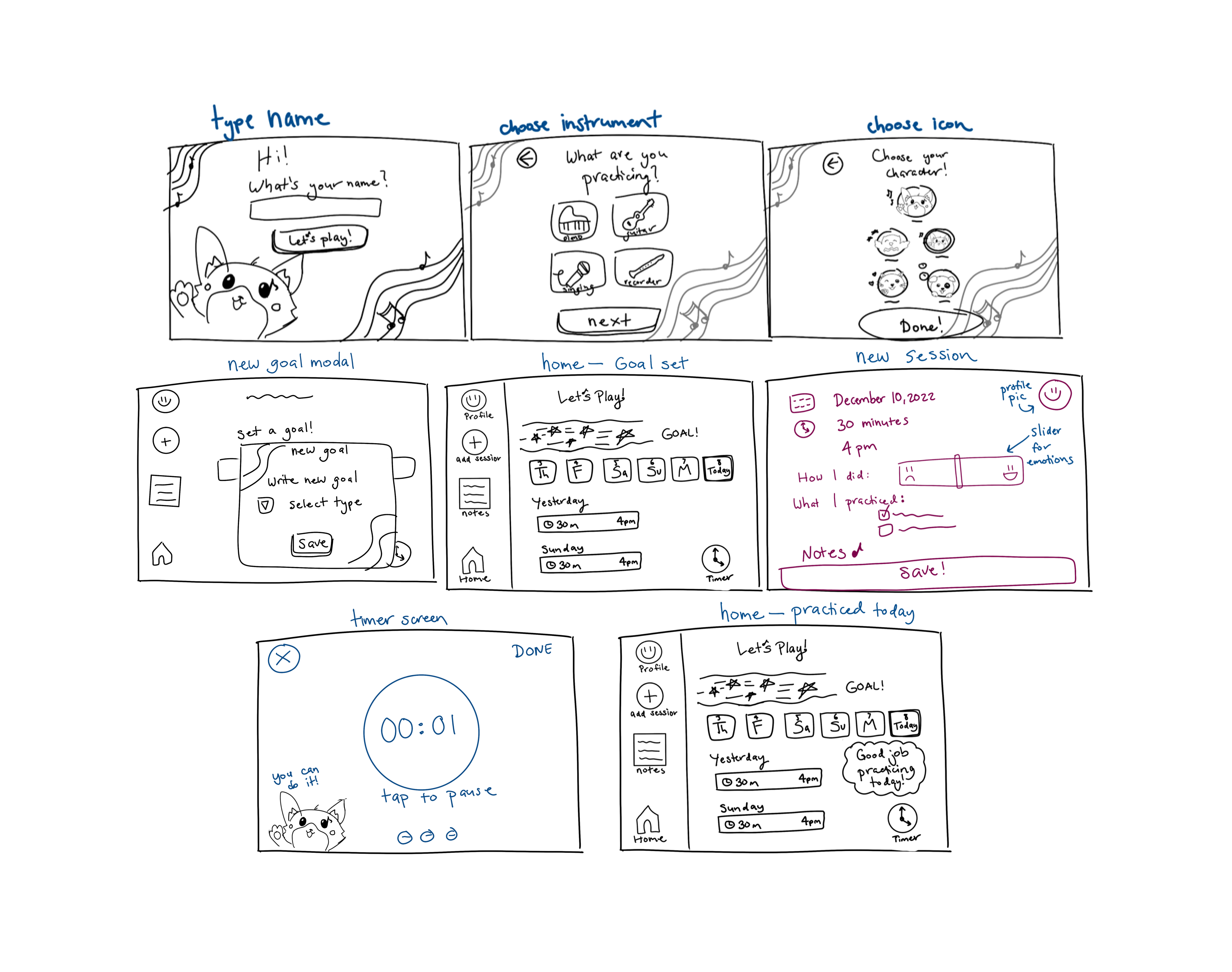
Sketches


Wireframes
Logo

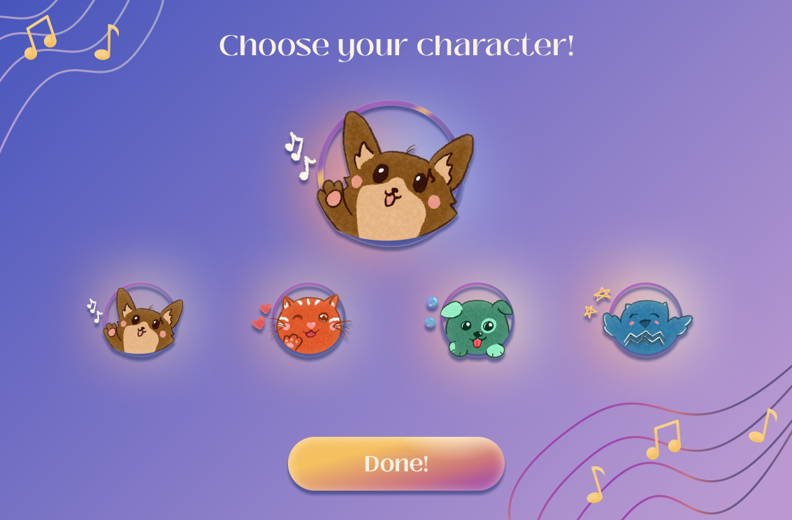
Characters
UI Kit


Challenges
- Ensure young users can use the app independently
- Content and terms are age-appropriate and easy to understand
- Create engaging and fun experience so users will want to continue using the app, and keep up with practicing!
- Use testing time efficiently to hold participants’ interest and get as much insight as possible - kids have short attention spans!
Successes!
Objectives:
- Simple, uncluttered user interface
- Delightful
- Sense of accomplishment
- Easy to read & understand
- Clear direction & feedback
- Easy to learn
Results:

Minimal components & simple navigation

Fun characters, whimsical & colorful

Motivating progress bar & goals

Larger fonts, terms understandable for younger children

Onboarding & freedom to explore

100% task completion & error-free rate


.png)


.png)
.png)
.png)
.png)


